 Gather Studio
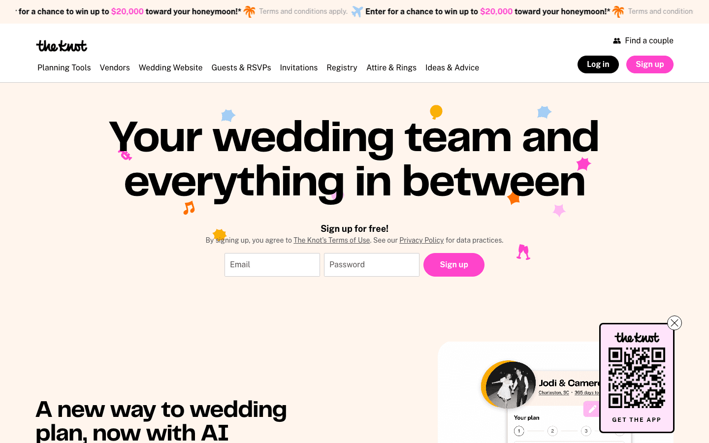
Scored across 6 Plainspoken Blueprint lenses. Each lens rated 0–10. The site is leaving significant opportunity on the table.
Plainspoken Blueprint Audit
Click any lens to expand findings.
Highest-Leverage Change
The Knot is the dominant wedding platform and their homepage has no photo of a real couple. A cream background, confetti emojis, and a sign-up form. For the company that has been in more weddings than anyone on earth, that's the single biggest miss.
Opening Line for the Video Audit
“The Knot has helped 25 million couples plan their wedding. Their hero image is confetti emojis on a cream background. I want to walk through their homepage with you — because what a platform this size gets wrong tells every local wedding vendor exactly what to get right.”
What We Found
The actual headline is 'Your wedding team and everything in between.' This is warmer than expected but still vague — 'everything in between' describes nothing. A newly engaged couple landing here doesn't immediately understand what The Knot does or why to sign up. The platform has checklists, vendor directories, registries, websites, invitations, and more — none of that is in the hero.
The problem named is nothing — the site assumes the visitor already knows what The Knot is for. A newly engaged person who just got the ring and typed 'where do I start planning a wedding' into Google gets a form asking for their email and password before knowing what they're signing up for.
The navigation has 8 categories: Planning Tools, Vendors, Wedding Website, Guests & RSVPs, Invitations, Registry, Attire & Rings, Ideas & Advice. Every feature competes equally. There's no 'start here' for someone who got engaged yesterday. The site is built for returning users, not first-timers.
The primary CTA is a full email/password sign-up form in the hero — 'Sign up for free!' This is actually a strong conversion move for a platform where the value requires an account. The banner above it ('Win $20,000 toward your honeymoon') competes with the sign-up and makes the hero feel cluttered.
There is no photo of a real couple in the hero. The background is cream/white with animated confetti emoji graphics — music notes, stars, wedding bells. This is the homepage of the largest wedding platform in the country. No couple. No wedding. No emotion.
Full Marketing Audit
theknot.com — dominant SEO, 25M monthly visitors; hero has no human photo
@theknot — 1.3M followers, real wedding photography content; far stronger than homepage
Top referral source for wedding searches — stronger conversion driver than homepage
@TheKnot — planning guides, real weddings, consistent uploads
Heavy email marketing — checklist drip, vendor recommendations, registry promotions

Matt Headley · Gather Studio

Ready to fix what this audit found?
These changes are targeted moves that put your best proof front and center. Gather Studio does exactly this kind of work.
Gather Studio by Matt Headley · Alabama